

In today’s ever-evolving digital world, user experience (UX) plays a pivotal role in the success of any website. Web design, in particular, significantly impacts how users interact with a site and its content. We’ll explore how responsive web design enhances accessibility, boosts SEO rankings, increases user engagement, and leads to higher conversion rates.
Adaptability Across Devices:
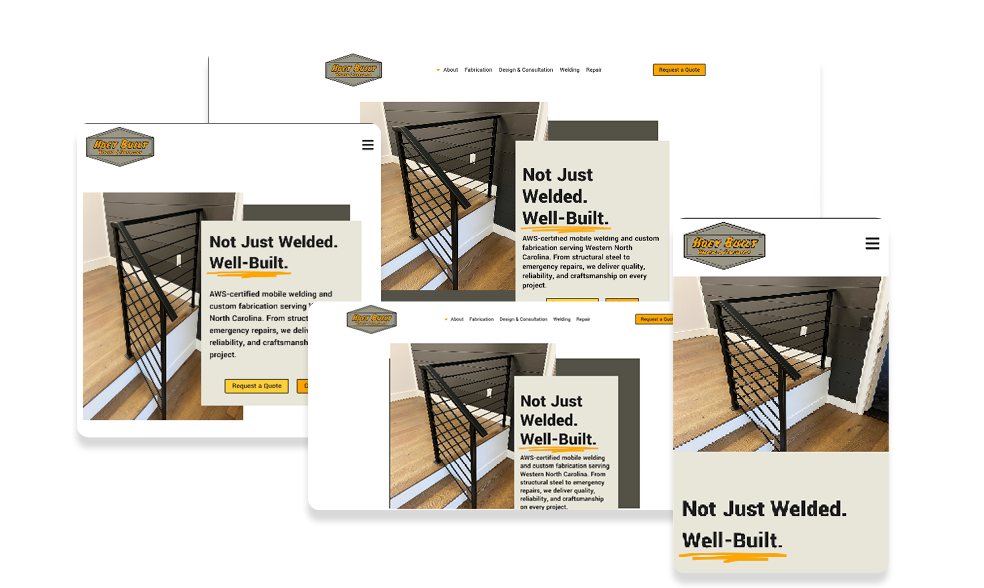
Responsive web design means building a website that can change and alter its layout based on the device accessing it. We need to ensure that a website can adapt and display its content appropriately across various devices, such as desktops, laptops, tablets, and smartphones. As the number of mobile users continues to rise, having a website that works seamlessly on all screen sizes is crucial. Some things to consider:
- Avoid rigid set width/heights: If you set the width of an object on your page to be wider than a user’s screen, they will have to scroll left and right to see the contents when on a device like a smartphone. Using percentages and other variable settings instead of pixels can ensure that your image, or container, takes up the perfect amount of space on every screen.
- Mobile First: Avoid bad mobile layouts by starting your design with mobile devices in mind first. According to recent statistics, a staggering 58.43% of website traffic comes from mobile devices, making it clear that catering to mobile users is no longer optional but necessary. If your design works on mobile, it will most likely work on a desktop, but not vice versa.
- Responsive Assets: Not every image works on all screens. So you may need to replace it. Let’s say you have a large section on your site and want a picture to fill it entirely. But when you go to another device, the image fills the screen differently and looks off. Simply cropping the image and setting your media queries to use a different image at that resolution can make it fit your design better on smaller (or larger) devices.
Faster Page Loading Speeds:
Page loading speed is critical to user experience and search engine rankings. With responsive web design, the website’s layout and content adjust dynamically based on the user’s device, resulting in faster load times with approximately 4.32 billion active mobile internet users worldwide; ensuring that your website loads quickly and efficiently on mobile devices becomes even more imperative. Improved speed reduces bounce rates and enhances the likelihood of visitors staying longer and exploring more pages, thus positively impacting SEO and user engagement.
Enhanced SEO Performance:
Search engines like Google prioritize mobile-friendly websites that provide a positive user experience. Responsive web design fulfills these criteria, resulting in higher search engine rankings. Responsive design becomes essential to your SEO strategy, considering the significant portion of website traffic from mobile devices. With a single URL for all devices, responsive sites also eliminate the need for separate mobile versions, avoiding the risk of duplicate content penalties and streamlining the overall SEO approach.
Consistency in Branding and User Interface:
Consistency in branding and user interface is vital for building visitor trust and recognition. Responsive web design ensures that the website’s appearance remains consistent across all devices, preserving the brand’s identity and providing a familiar user experience. A unified design also makes it easier for users to navigate and find the information they seek, boosting their confidence in the site’s credibility.
Access to Wider Audiences:
Not all users access the internet through traditional devices. With the rise of smartwatches, smart TVs, video game systems, smart home devices, tablets, and other internet-enabled gadgets, responsive web design allows your site to cater to a broader audience. By embracing this approach, you open up opportunities to engage with users across various platforms, expanding your reach and potential customer base.
The Power of Responsive Web Design:
Web design significantly influences user experience, and responsive design is essential in creating a positive and user-friendly online environment. With a large percentage of website traffic coming from mobile devices and an overwhelming number of internet users relying on mobile phones to access the internet, responsive web design is no longer an option but a necessity.
By ensuring adaptability across devices, faster page loading speeds, enhanced SEO performance, consistent branding, and reduced bounce rates, responsive web design sets the stage for increased user engagement and higher conversion rates. As digital marketing professionals, integrating responsive web design into your strategies will help our clients succeed in today’s competitive online landscape.


